Brand Font
- Mystery Hare

- Feb 13, 2024
- 3 min read
Updated: Jan 8
The choice of Brand Font works to further emphasise the perception and personality of your brand. It further emphasises the perception of quality of the service your ideal client expects and the level of your expertise. Fonts can also be nostalgic when clearly pointing to a specific era in time, especially if very distinct and fashionable.

Similar to when we researched the colour meanings of the chosen Brand Colours, Brand Fonts can instil a certain perception of the brand, it can also imply a price category and service quality.
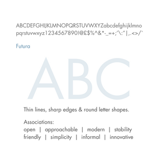
Here are the Names and Associations of my chosen fonts – the font used in my logo and my Brand Font which I use everywhere else. It both compliments and emphasises my brand personality while leaving my logo font distinct.
It's important not to use the same font as your logo otherwise your logo starts to look generic. You need your logo to be memorable and you can't do that if you're repeating a single font everywhere. People look for patterns, this is why font hierarchy is so important for legibility and understanding of the message.
As you might be able to tell, both my chosen fonts (Logo and Brand) are pinpointing a specific era, the Art Deco/Bauhaus era/movement. This is interesting to ME as I appreciate the functionality of Bauhaus and the leaps in modernity, both in fashion and female-empowerment of the Art Deco era but does my chosen font speak further to the following:
Service expectation
Price Category
Target Market
Industry Expertise (to this I say 'yes' but would the expertise only be recognised by industry experts, in which case, 'no')
Brand Personality
Like your logo and colours, your chosen fonts are also doing a job to make your brand memorable but to also start building a brand reputation – if your brand is disjointed in any way, this starts to breed mistrust which takes so long to heal from. If your brand is slick but prices are cheap it's signalling a disjointedness to your clients which they will question, even subconsciously, and this breeds mistrust. By building a consistent brand you build rapport with your target clients based on 'trust' which creates advocates out of clients, they will refer you and defend you. This is the best marketing money can buy and it only cost you a branding exercise – something to think about!
I'll be taking a small break over February half term but will be rejoining this series with 'defining my target client demographics' and hopefully creating a Client Profile in order to help me further decipher my current brand. I also want to establish where my brand needs to evolve in order to 'speak' more directly to my target clients.
If you found this blog helpful, follow along with my social media series. Follow and like my posts on Facebook and LinkedIn. You can also catch up with any content you've missed by clicking on the link here.
If you have any questions about your brand or want some honest feedback on how I think your current brand is being perceived externally, drop me a line and let's set up a non-obligation 20-min zoom meeting.


Comments